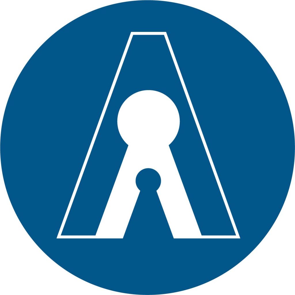
VDD Studio recently engaged in redesigning the International Symbol of Access as part of a competition run by the International Union of Architects and Rehabilitation International. Our design is the culmination of a collaborative project facilitated by a volunteer-based studio endeavouring to bridge the gap between built environment design and lived experience of disability. Our intention with our proposed symbol of access is to reflect the diversity and complexity of access needs, through a more inclusive symbol that is simple, practical and distinguishable.
As part of our design research, we conducted a survey exploring perceptions of the existing symbol and key elements to be included in redesigning the symbol. Our survey results showed that 60% of (254) respondents consider the existing symbol to be a symbol of disability rather than a symbol of access. Further to this, over 65% of respondents do not consider the symbol to be inclusive of all people with access needs and over 75% of respondents do not consider the symbol to be inclus
ive of all people with disability. Qualitative responses guided initial design responses, ascertaining key issues with the existing symbol and highlighting potential elements and ideas to include whilst redesigning the symbol. Based on these responses we refined our design and invited respondents to be further involved in a design discussion and review. Thus, the engagement process enabled us to further develop the design, reflecting inclusion and space. The process of learning about and exploring notions of access, disability, diversity and inclusion and how these can be graphically represented was considerably beneficial. Through engaging with people with disability, we gained a heightened understanding of how the symbol represents more than just access, with many adopting or perceiving the symbol as representative of disability. Given the complex meanings and significance of this symbol, our approach to redesigning has been guided by those with lived experience, ensuring respect and sensitivity. Through further analysis, we believe the potential difference between an international symbol of access and an internationally recognised symbol for disability should be acknowledged.
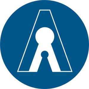
Our design attempts to reflect diversity and complexity through multifaceted interpretations and meanings of the symbol. The void interprets access through the depiction of a keyhole as a universal symbol representing access. Further to this, the shape can also be understood as an inclusive representation of the human body, placing emphasis on both body and mind. Through adopting a more abstract depiction of the human body, we are attempting to avoid any depictions that may discriminate against the diversity of access needs or place emphasis on singular disabilities or impairments. Another layer of this symbol is that of space, thus showcasing people within a space that is inclusive of people with diverse needs. The reference to this space draws upon the Social Model of Disability highlighting the enabling/disabling capacity of the built environment. Recognising the significance and history of the existing symbol, we have maintained a similar graphic language, with emphasis on circular and curved forms and a similar colour palette to support recognition.


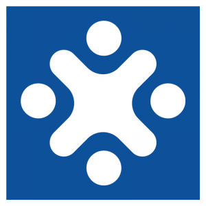
There were over 350 submissions to the competition and the winning designs were commended by the jury as “abstract, simple, easily replicable and recognisable” and focussing on “fullness, not absence” exploring similar ideas of inclusivity. The three winners are included below; we also recommend viewing the other submissions to see the diversity of ideas and approaches. We congratulate all entrants, winners and honourable mentions.

